By Ryan Yousefi
After receiving backlash from residents on its new logo and tagline, Parkland leadership has decided the city that claims to be Right Where You Belong isn’t yet where it needs to be in its rebranding process.
Less than two weeks since Parkland Talk reported the process of updating the city’s new logo and tagline cost taxpayers $90,000, the city government has agreed to take a step back and reassess the rebranding.
During this past week’s open-to-the-public city commission meeting, two residents used their speaking time to take issue with Parkland’s recent rebranding efforts.
“I have to say that this tagline (and campaign) that says you’re right where you belong has a picture of a family that doesn’t look like my family or some of the families that I know,” said Parkland resident Taneka Lawrence, who is Black.
“I’m just wondering if there’s an opportunity for us to revisit this ad and see if there’s a way to kind of highlight more of what it looks like to be in Parkland.”
“The demographics are changing here, and it could be an opportunity for us to highlight that to the rest of the world.”
Echoing some of the sentiment Lawrence put forth, Parkland resident Jon Faber gave an impassioned speech that what was unveiled as the city’s new logo and tagline wouldn’t cut it.
Faber said that while he doesn’t take issue with the $90,000 price tag spent on the campaign in relation to the city’s $40 million budget, he dislikes the logo and how it portrays modern-day Parkland.
“When I saw our logo and the marketing around it, I just thought that we could do a lot better of a job,” Faber said.
“We’re the best city in Florida, and we should have the best logo. That logo is cheap, it’s boring, and it’s plain. It’s not Parkland.”
Following the open mic moments, city commissioners had a chance to address the concerns, indicating it’s back to the drawing board on the entire process.
“I believe that we need to revisit it as a commission. We didn’t have an opportunity for all of us to talk about it,” Commissioner Bob Mayersohn said.

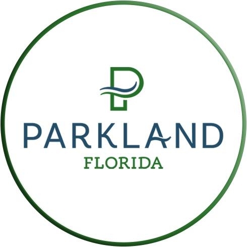
The City of Parkland’s new circular logo.
Mayersohn addressed the issue by pointing out concerns he says the committee has received since the city announced its new tagline, specifically from minorities and members of the LGBTQ communities.
“There were a lot of comments that obviously were posted on social media, individual comments, and we received some emails about it,” Mayersohn said.
“I just think we need to revisit it. I don’t think we should be dismissive of the comments of our residents. We’re not a corporation, we’re a city, and we have to be sensitive to those needs.”
“The tagline obviously has some issues, in my opinion, to our black and brown communities, our LGBTQ communities. We don’t want to trivialize it. We want to make sure that what we’re doing is the right thing.”
Commissioner Jordan Isrow seconded the concerns highlighted by Mayersohn, saying; however, he believes the issues stem from the artistic interpretation of the data collected in the study that led to the rebranding.
“I think there is something to be said about being able to translate data into an artistic design, which in and of itself, it’s an art, not a science,” Isrow said.
“Everyone has a different vision of what certain values or principles can look like on a piece of paper, but I agree – we as a commission should want our residents to be proud of the brand with which they are supposed to identify with; that’s supposed to represent them.”
There is currently no timetable for the redesigning of Parkland’s logo nor a change of the brand-new tagline.
Send your news to Parkland’s #1 Award-Winning News Source, Parkland Talk. Don’t miss reading Tamarac Talk, Coral Springs Talk, Coconut Creek Talk, and Margate Talk.
Author Profile

Related
 NewsNovember 8, 2025Marjory Stoneman Douglas Band to Perform in Rome’s 2027 New Year’s Day Parade
 NewsOctober 28, 2025Westglades Middle, Marjory Stoneman Douglas Shine at Elite South Florida Speech and Debate Tournament
 NewsOctober 28, 2025Man Arrested After Demanding Oral Sex and Beating Pregnant Victim During Violent Attack
 NewsOctober 20, 2025MSD Drama Club’s Falloween Fundraiser Returns October 25


